[ad_1]
Hi all! My name is Math Roodhuizen, I’m a 3D artist with an interest in VFX / tech art for games. I graduated my game art education at the HKU in Utrecht in July 2018 and am currently working as a 3D junior artist at Force Field. I initially wrote this around the time of my graduation, but it is still relevant. I learned a lot from making this effect, and I’m sure some of you will learn from it as well!

For this blog post I’ll go in-depth in how I created this effect. I created something similar a while back in UE4 for my graduation project. This effect is made in Unity however. As part of my final year in my game art education, I had to do something called ‘knowledge transfer’. For this, I was helping out in the VFX classes in my uni. Most students used Unity and had little experience with shaders, so in an attempt to strip away as much confusion as I could I ‘ported’ this effect from UE4 to Unity for my guest class. This way the students could focus 100% on the subject matter and hopefully not be distracted by a totally new interface by using UE4 (though the shader graph system in UE4 and the one I used in Unity, Amplify Shader Editor, are very similar).
Before I start the breakdown of this waterfall effect, it’s important to give credit to Simon Trümpler, artist at Tequila Works where he worked on RiME. I learned a bunch from him over at his blog (link to the specific blogpost/talk). I was relatively new to shaders / VFX when I found his talk. I watched the talk and I got super motivated to learn things like this for myself. By trying to create something similar I learned a lot about the creation of such effects which resulted in me being able to create cool effects by myself which I couldn’t do before. I highly recommend you check out his talk if you want to learn more about ways to create stylized effects (like fire, for example, there’s also a relatively new one about the water shader used in RiME).
In this blog post however, I will try to go in-depth into this waterfall effect. I’ll be focussing on people who are relatively / completely new to using shader graph systems. The goal is to try to teach you new ways to work with shader graph systems and hopefully make you understand shaders a little bit better (even though this will be in Unity, most of it will apply to UE4 as well). I try to visualize every step with either an animated GIF or an image, as from experience I know many of you will have a very visual mindset. Visualizing everything has helped me a lot in the past.
I used the following tools:
- Unity 2018
- Amplify Shader Editor (Unity plugin) – if you don’t want to spend any money, Unity has introduced its own shadergraph system, but this is still in development.
- Autodesk Maya (again, Blender will work just as fine if you’re on a budget).
- Something to generate or edit textures could come in handy (I use Photoshop, or sometimes even Substance Designer to quickly generate some handy textures, but you certainly won’t need this for this effect).
Again, you could make the same thing in Unreal Engine, so if you’re used to Unreal just try to go along, you’ll be fine!
Ripple effect: panning
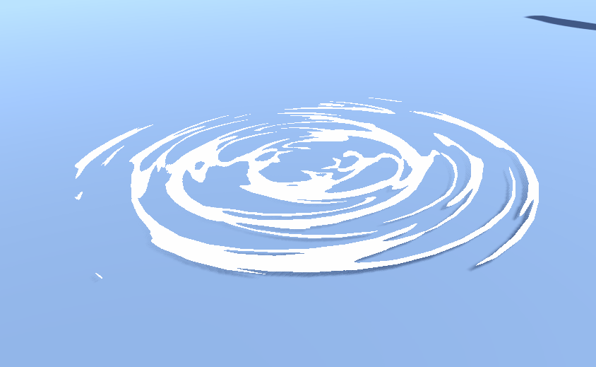
First, I’ll go into the ripple effect where the waterfall hits the water surface. You could go a lot further with this (please check out Simon’s talk!!) but for now we’ll stick to the basics. You could use this material for other things as well, for example the ripples around objects that are sticking out of a water surface, or you could put them on a spline and place them along shorelines to make them look like waves.

Open up Unity and make sure you have a shader graph plugin installed. I’m using Amplify Shader Editor. If you are completely new and don’t have Amplify Shader Editor, I’d recommend you get a basic understanding of how the shader editor you are working with first.
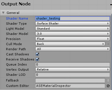
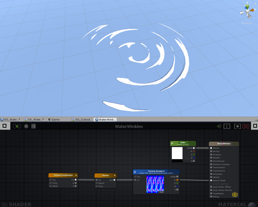
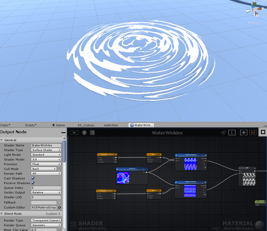
Create a new material and give it a descriptive name (I called it MAT_WaterWrinkles). Then right click the material in the project tab and go to create > amplify shader > surface shader. This should apply the new shader to your material automatically. You can always select the shader in the material tab > shader dropdown and select it there if it did not apply it automatically. (for shaderforge, it should say something like PBL shader, basic lit should do the trick for this shader as well). Make sure you name everything neatly, or you’re gonna have a bad time – stick to naming conventions! Remember you have to name the shader both in the folder view and in the actual shader once you have opened it.
Once you have opened your new shader you should see something like this.
I’m not going to write a full in-depth tutorial on how to use the shader graph. If you are totally new to this it might help to watch some introduction tutorials first.
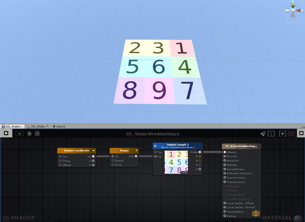
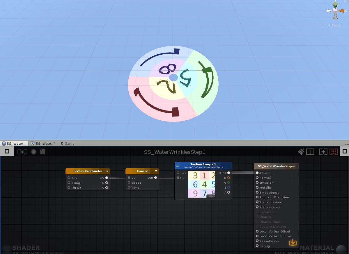
To get the desired effect, first we’ll need a basic panner. here’s a panner with a test texture applied to a plane:
A panner moves the UV coordinates around. Make sure the wrap mode of your texture is set to repeat instead of clamp, so it tiles. In Shaderforge you might have to connect a time node to the panner input, amplify has some of these basic values already enabled in the node itself. You can edit these values (panning speed and direction, for example) by clicking on the node and editing the settings.
So alright, we got a moving texture now, but to achieve this effect…
We’d really want it to pan like this…

As you can see, the node structure is the same – the panner allows us to move the UV coordinates in the U and V (or X and Y…) direction. To achieve the desired panning direction, we’ll need to make a custom mesh with some nifty UV’s. This is probably the easiest way to do this, I made a GIF that demonstrated why and how this works.
So with the same material applied to a different mesh, we can have some control over the direction in which the texture moves in 3D space, whilst it does exactly the same in UV space.
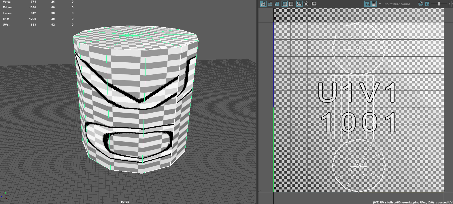
To enhance the ripple effect for later on, I gave it some more poly’s and distorted the UV’s in such a way that the texture moves faster in the center then it does at the edge of the mesh, so it feels like the ripples are losing speed. I also placed the UV’s in such a way that when you move a texture around, it wraps around perfectly so you don’t have a visible seam on your mesh.
This also brings us to a valuable lesson: a good visual effect rarely consists out of a single system and often is a combination of multiple systems working together. A good shader, some well designed textures, some particles and a well made mesh / UV’s are all things you can combine and let them work together into one single effect.
So now we got a texture moving in the desired direction. It is slower at the center as it is at the edges, thanks to the distortion of the UV’s that we did in our 3D software. The UV’s are laid out in such a way that, if you move around the UV coordinates from right to left in UV space with a panner it translates as an inward to outward motion in 3D space. The edges of the UV island are snapped to the edges of the 0 to 1 in the V direction of the UV space (select to UV verts, and snap to grid with X), so that we don’t get a texture seam on the 3D model. As you can see, we now got all the basic ingredients for our desired effect!

Ripple effect: transparency
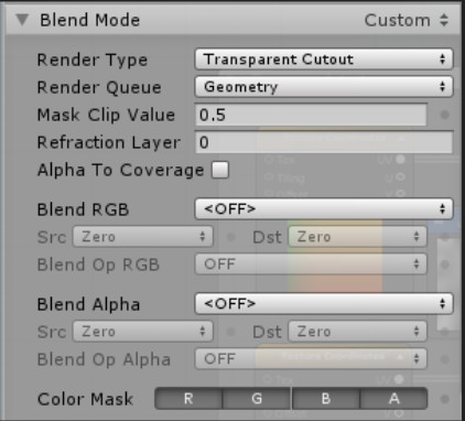
Next we need some transparency. Just a quick rundown of stuff you should know when working in a shader. A lot of the simple calculations you’ll do in a shader will be with values of 0 and 1, and everything in-between. Generally speaking, 0 = black and 1 = white. This also means that 0.5 is a gray tone and, for example, 0.2 is a dark gray tone. When you hook these values to, in this case, the Opacity channel of your main output node, you’ll control how transparent the material is rendered. Keep in mind that you will have to enable this to give the shader the ability to do this. In amplify, you can change the render type (under blend mode) from Opaque (no opacity at all) to, for example, transparent. In this case we’ll use the ‘transparent cutout’ render type. This means a pixel displayed by this material is either completely transparent, or completely opaque. You can also see this in the GIF above, there are no ‘half transparent’ pixels displayed by this shader.
To demonstrate what happens, I took a step gradient texture and put it in the shader. Here it is hooked up to the albedo (color) output of the main node.
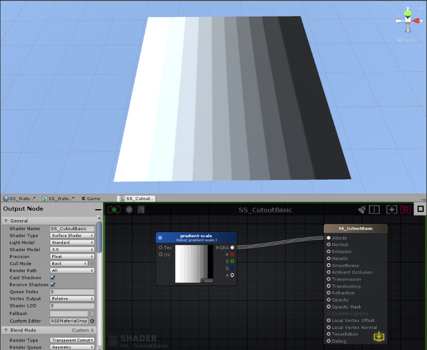
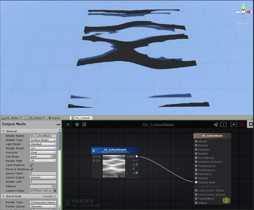
And here it is hooked up to the Opacity Mask output (this one is enabled when you choose the transparent cutout render type).
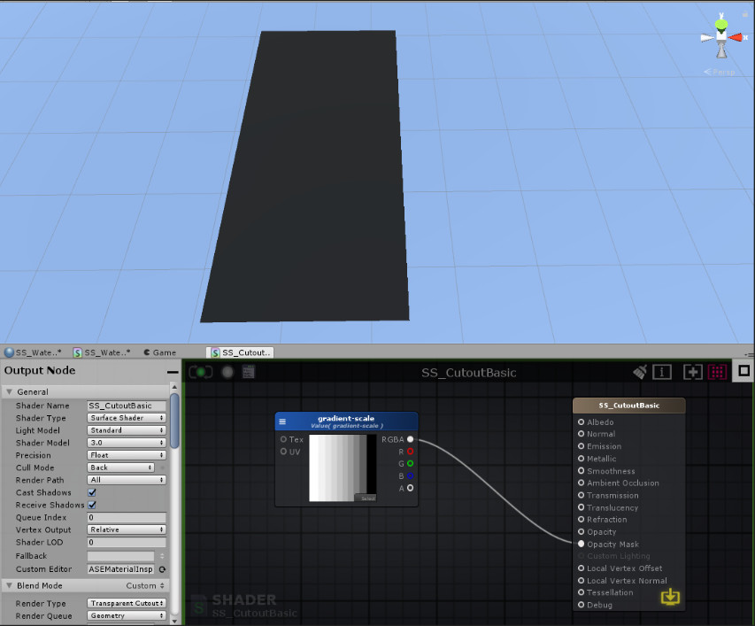
As you can see, it used the black/white values of the pixels of the gradient texture to decide to either render it opaque or fully transparent. Everything between 1 (white) and 0.5 (gray) is rendered opaque, and everything between 0.5 (gray) and 1 (black) is rendered fully transparent (or not rendered at all, I guess). The opacity mask creates a hard cut-off and ’rounds’ the values off to either 1 (opaque) or 0 (transparent), whichever is the clostest value.
Another grayscale texture…
Hooked up to the opacity mask…
You get the idea. You probably also understand how we can use this to get our desired effect…
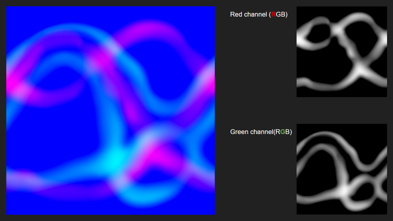
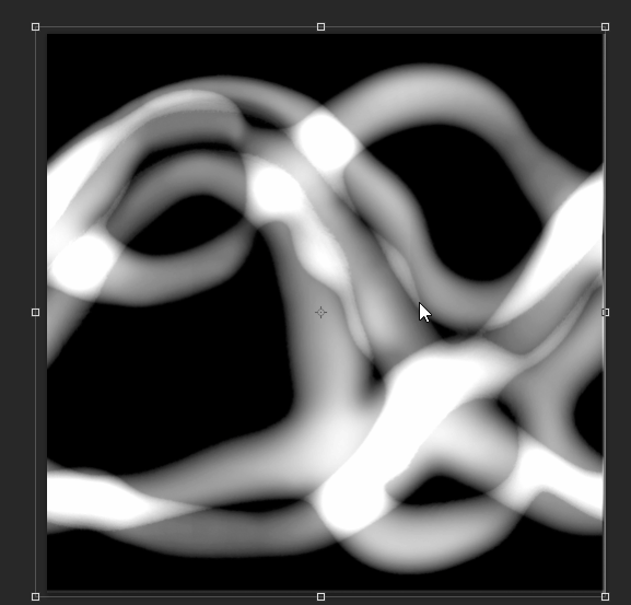
Just to clear up some possible confusion, you see a mostly blue image scrolling in the shader graph above. You also see I’m only using the R (red) output of that node. For optimization reasons, I have packed 2 grayscale textures in a single file. You don’t really have to do this, I just try to constantly keep optimization in mind. It’s also a lot more neat. You can pack images like this using Photoshop or Substance Designer.
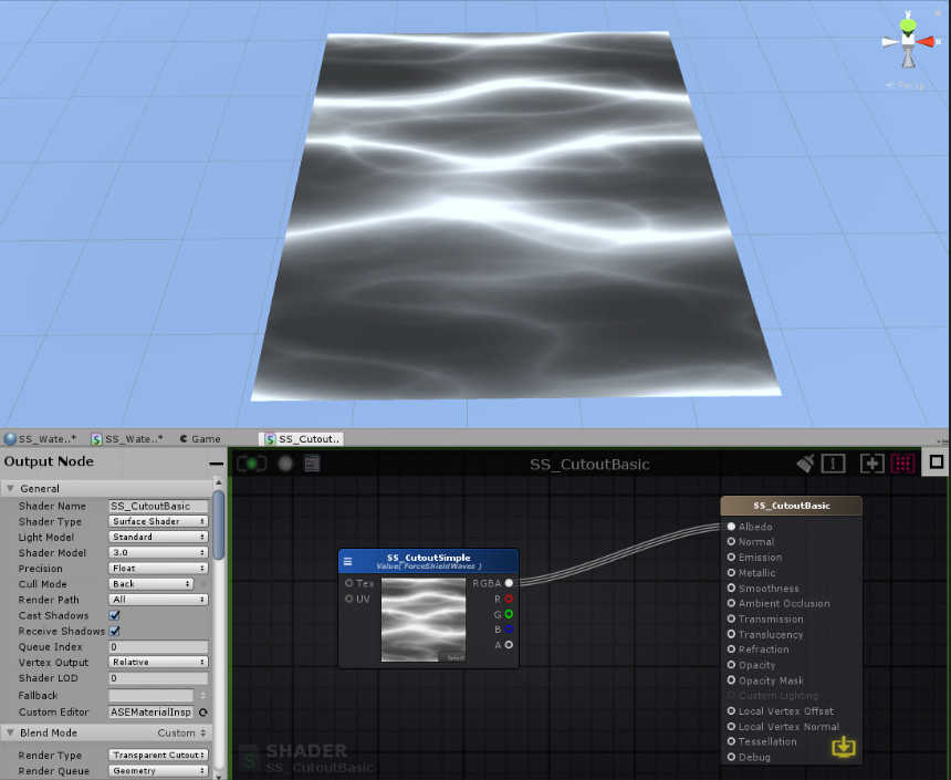
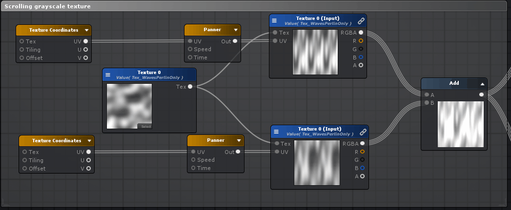
As you can see, I’m still just working with grayscale images. The ripple effect we got now is a good start, but we can do better! Why not layer 2 grayscale textures on top of eachother to get a more random feeling effect?
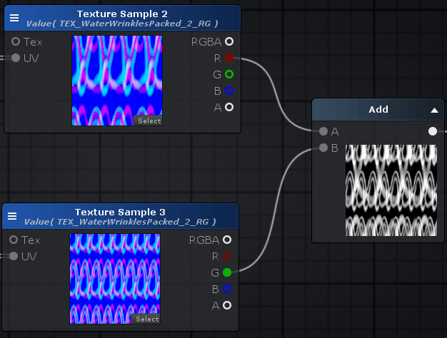
As you can see we are using the same texture, but adding the different channels on top of each-other. We are also panning them at different speeds, and in a slightly different direction. I made the texture in such a way that it has a nice gradient of gray values. This gives us this randomly feeling watery effect. Note that the GIF below has one extra thing added in the graph we did not yet discuss so don’t be scared if yours doesn’t look as watery.
A pixel with a value of 0.2 (which is not rendered) passes on top of a pixel with a value of 0.4 (which is also not rendered, only those above 0.5 are) it suddenly is a pixel with a value of 0.6, because we are using an add node (the 0.2 is added on top of the 0.4 making 0.6). Adding these 2 wavey grayscale textures on top of each-other with different speeds gives us close to the desired effect.
To demonstrate what happens, I put two grayscale layers on top of each other with the top one on the ‘add’ blendmode.
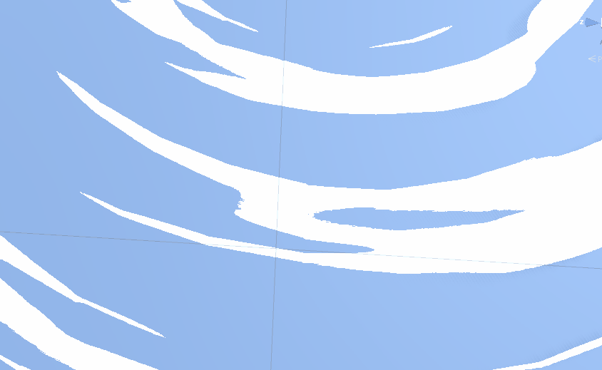
However, the seam at the end of the mesh is still way too obvious. What we really want to have is this:
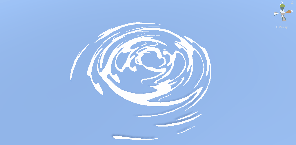
Instead of this:
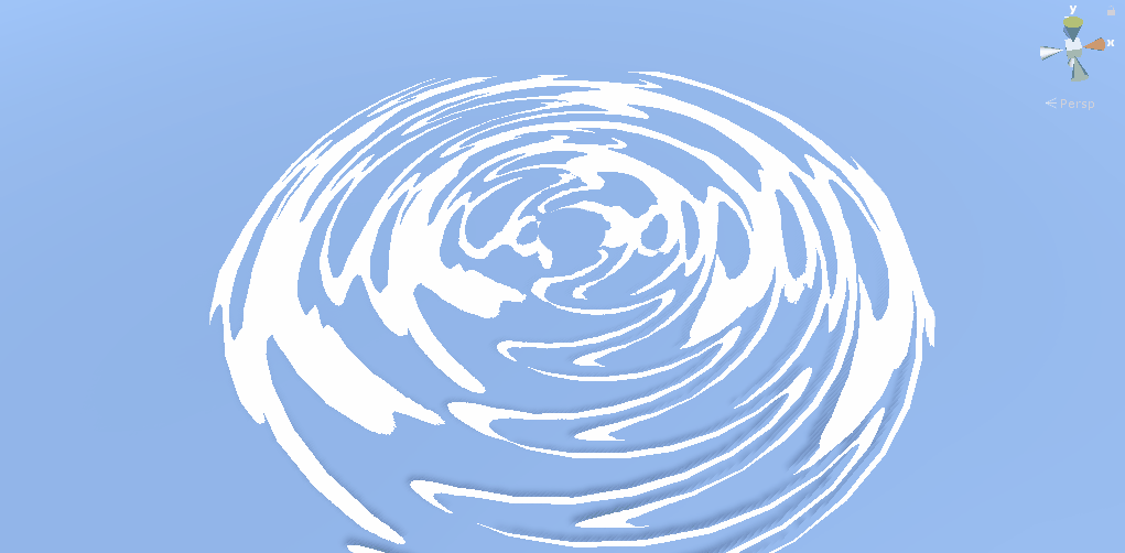
Note how the ripples kind of slowly die and become smaller when they near the end of the mesh in the first one, compared to the hard cutoff in the second one. As far as I know, the simplest and cheapest way to do is is to utilize vertex colors.
Vertex colors are, again, 0 to 1 values. Every vertex in your 3D model has some data with it. The X, Y and Z position obviously is one of them, the normal direction another one. You can also give every vertex a vertex color using your 3D software. Just like textures, you can use the R, G and B channels separately or together. Here you can see the vertex colors I’m using. The most outer vertices have a value of 0 (black), getting more white (closer to 1) when getting closer to the centre (note you’ll really need some subdivisions to get the vertices to apply the color to).
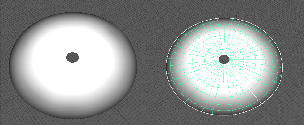
In Maya you can go to mesh display > paint vertex colors (hit the more options box) to paint these values. If you’re using Blender or Max and don’t know how to do this, just google it.
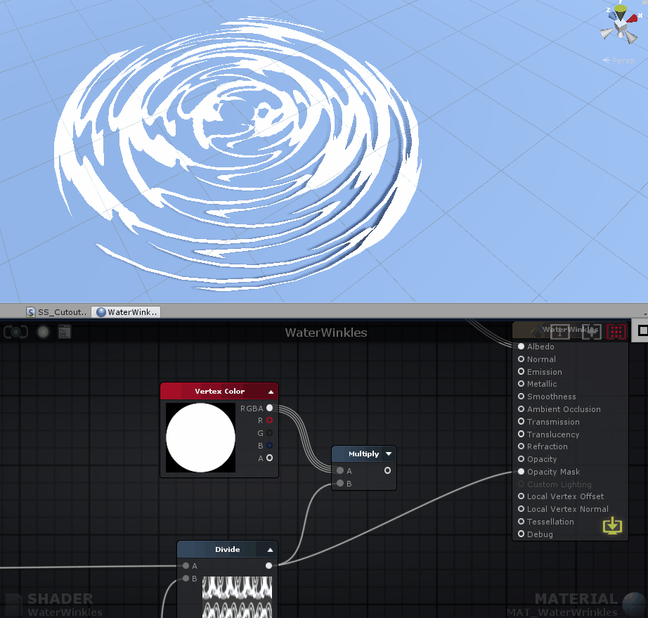
Now we can just hook up the vertex color in our shader with a simple multiply…
To demonstrate what happens a bit better, I also made a GIF in Photoshop. I put a gradient on top of the textures we are using and set the layer mode to multiply.
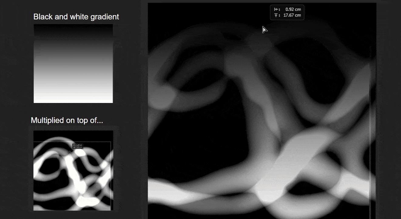
As you can see, the gradient forces the gray values more and more to 0 (black) so pixels will have to ‘fight’ harder to be rendered (remember, they are not rendered below a value of 0.5). This results in the ‘wrinkles’ getting smaller and smaller the closer they are to the edge (the vertex colors basically act as the gradient).

Here’s the full graph, I added some extra nodes that allows you to control the thickness of the wrinkles.
Just play around with the panning speed/direction, tweak the textures and try to change up the tiling (but make sure it will still tile in the UV’s!) to really get the most out of this effect.
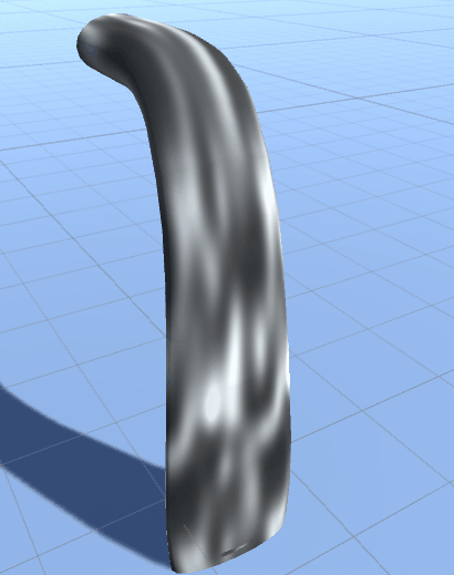
Waterfall: basics
Now we got the ‘water wrinkles’ working, time to move on to the actual waterfall itself. The reason I started with the water wrinkles first, is because it uses many of the same techniques as the waterfall, but the overall shader for the waterfall is more complex and has some extra stuff going with it. For this reason I won’t go as in depth in the things we already talked about.
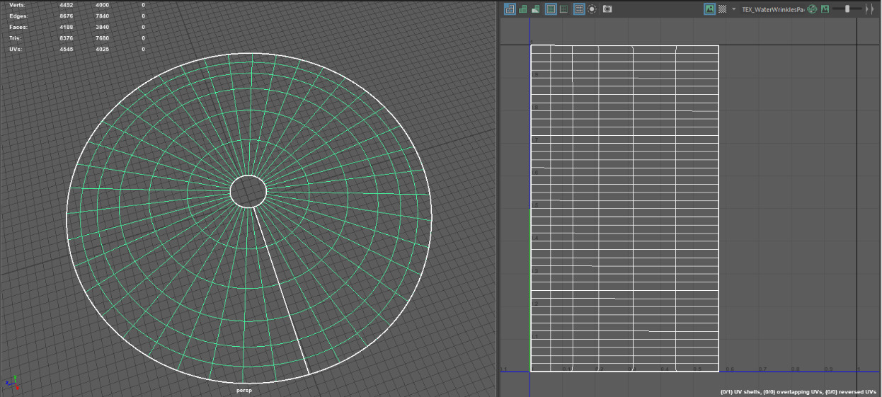
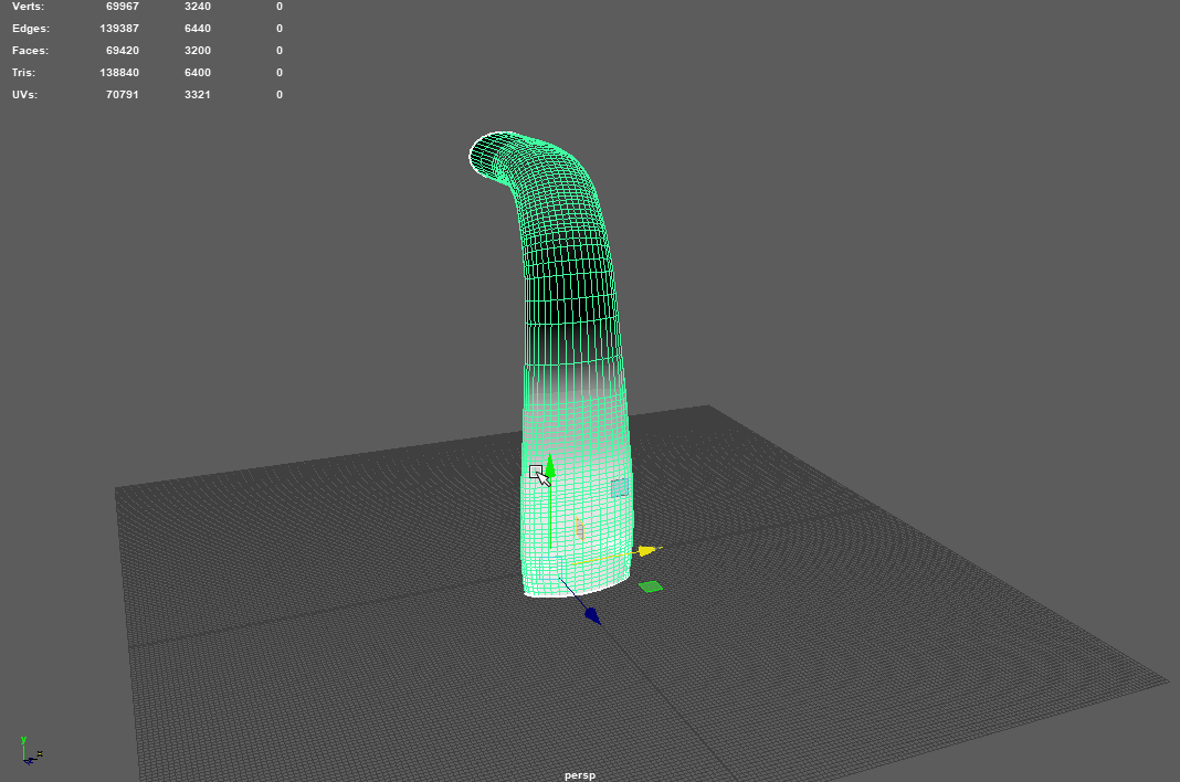
To start with the obvious, we need a basic panner and a mesh to pan it on once again! You might wonder why it has this many polygons, and you’d be right to ask that question. Just like in Simon’s waterfall I want to make use of vertex displacement. As the name implies, this means we can displace the vertices of the model in 3D space via the shader. To make this look good though, we need some extra vertices. To optimize this you could easily create LOD’s, or Level Of Detail meshes, that have fewer polygons and make Unity swap to lower resolution models if you move further away. I’ll go more into vertex displacement later, but for now you know why it’s so high poly.
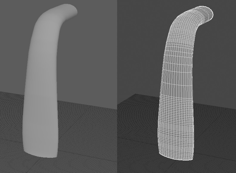
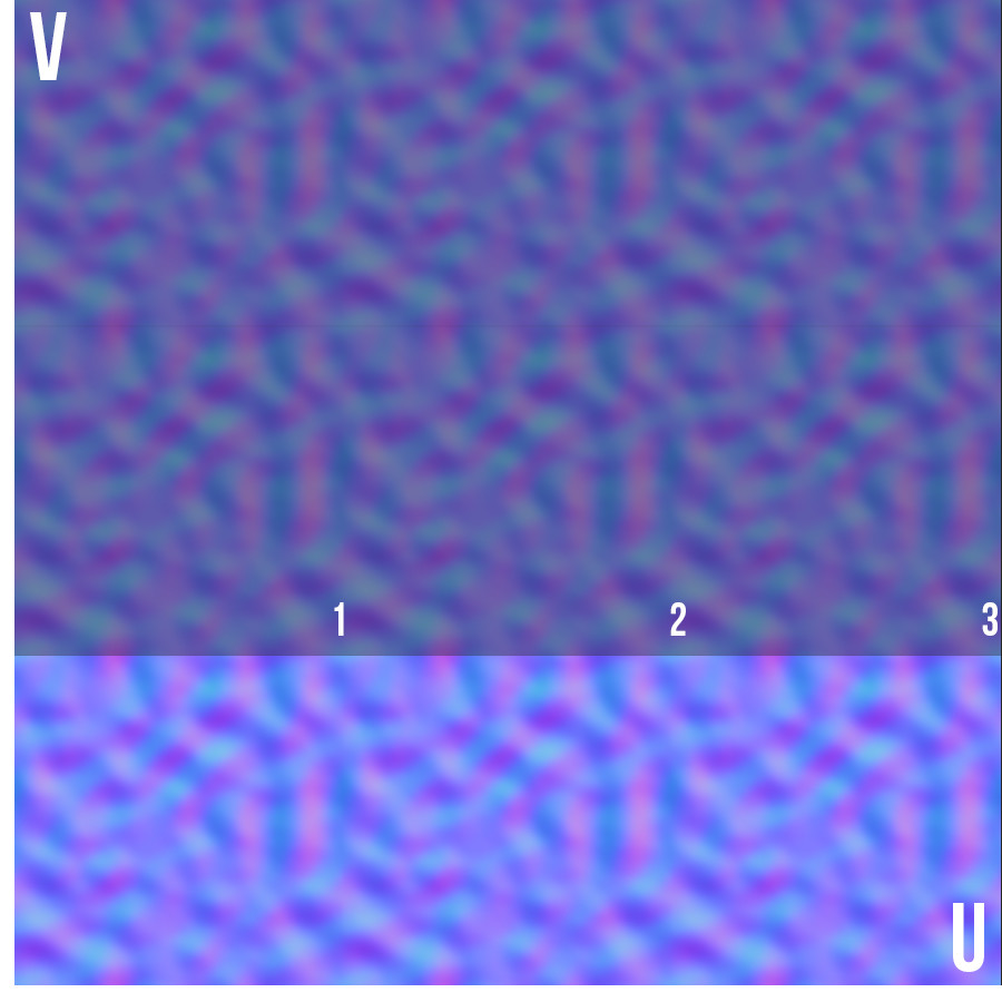
I put the UV seam at the back of the waterfall. Even though it shouldn’t have any visible texture seams, it still is considered good practice to always keep this in mind and try to put the UV seams in places least visible for the player. As you can see here, similar as with the water wrinkle mesh we made before, I UV’d it in such a way it should not have any texture seams on the model when using tiling textures. One side of the UV island is snapped to the 0 of the U direction, and the other one to the 1 of the U direction. We just have to keep in mind our tiling in the U direction, which has to be a round number (a tiling of 1, 2, or 3 for example). If we would tile it 1.2 times in the U direction we would end up with a seam on our mesh, because the texture is displayed 1.2 times in the U direction, so it won’t tile. Obviously, you will need a seamless tiling texture in order for this to work at all.
Here’s a normal map tiling 3 times in the U direction. Note how the very right of the 3d image meets the 1 of the U direction perfectly. If you set your U tiling to 3 this means that the texture repeats 3 times between the 0 and 1 in the U direction (the image below represents the 0 to 1 UV space).
To demonstrate, here’s the same texture tiling 2.2 times. When it wraps around, a seam appears. I realize this probably is very obvious to many of you. However, it’s important to understand why and how you have to lay out your UV’s in certain scenarios. Because we are dealing with panning tiling textures and also don’t want any seams we have to adapt our UV map in order for this to work.
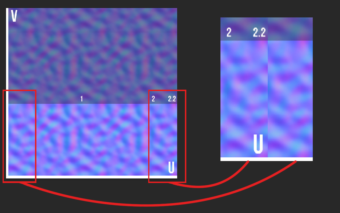
For completeness sake, here’s me moving the UV map around. With one of them the width of the UV island is exactly 1 so it tiles perfectly, the other one is scaled down just so you can see it now has a seam. Simple stuff! Since we are only using tiling textures the UV map doesn’t have to be completely within the 0 to 1 space.
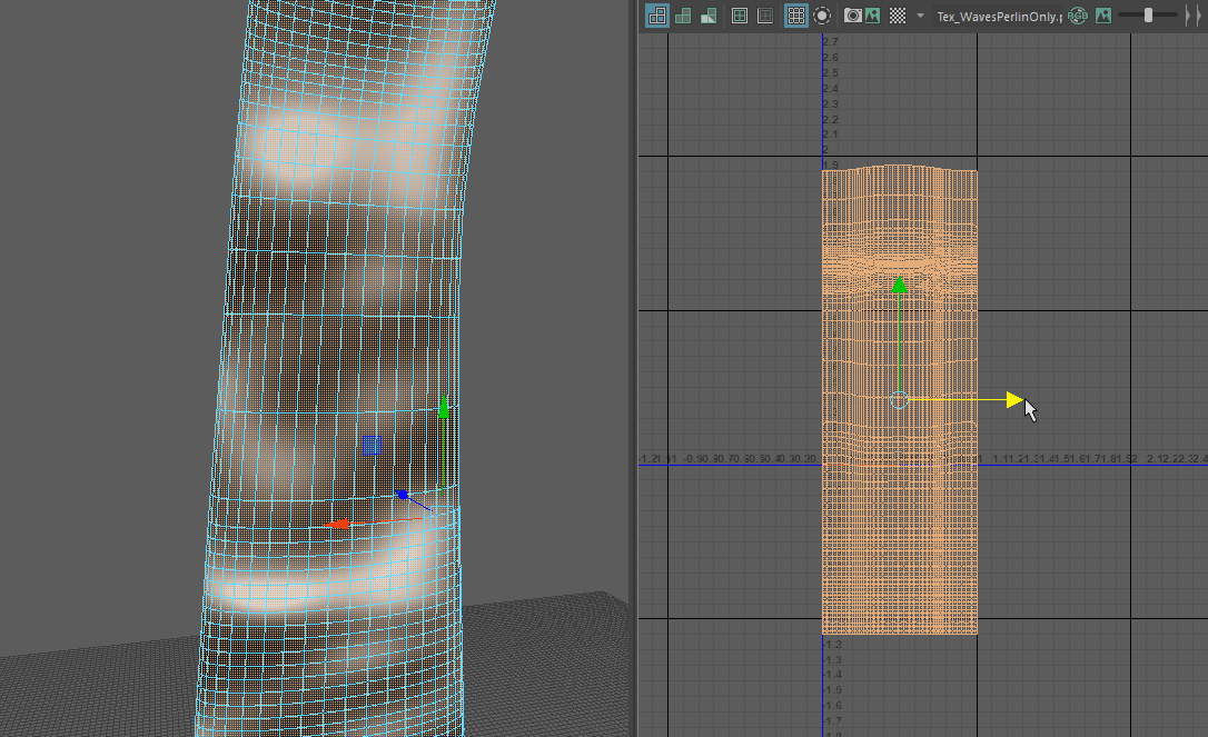
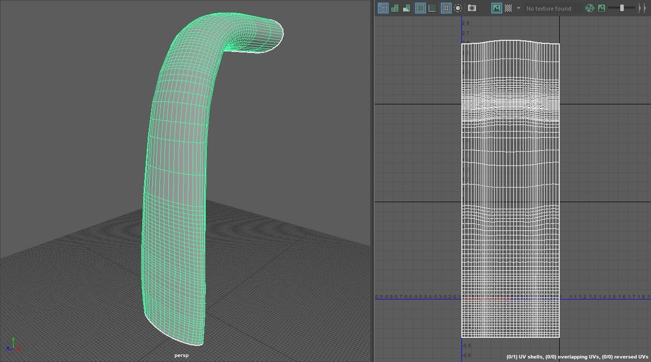
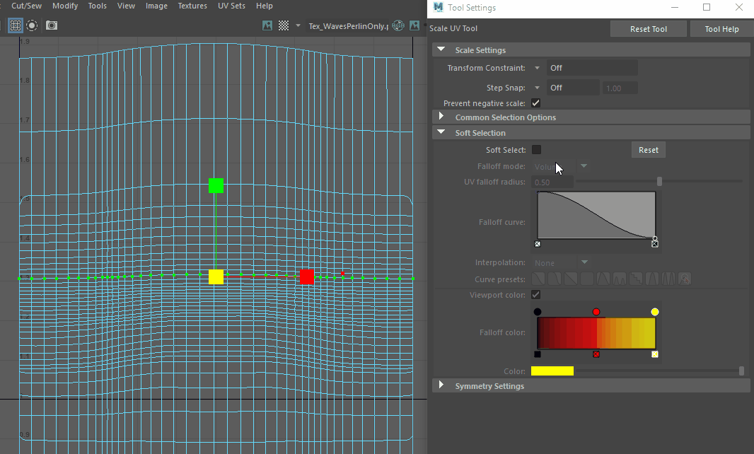
Just as with the water wrinkles, I distorted the UV map so when you are using a panner, the texture is moving faster or slower in certain points on the mesh. Here the extra polygons also help to make the transition between distorted areas less obvious. I like to enable soft selection to warp the UV’s to more easily get smoother transitions.
Here you can see this in action. Note how the texture is stretched more at the ‘bend’ of the waterfall. You can exaggerate this effect as much or little as you want. Always imagine the translation from UV space to 3D space. With the UV vertices closer together, a texture will move quicker around these UV’s in 3D space when using a panner. If you move UV vertices further apart, the texture will appear more frequent on that area of the mesh (appearing squished together), and move slower in 3D space when using a panner. Just experiment with this until you get the desired effect. In hindsight I would have probably liked to exaggerate this effect a bit more.
Note: this is a new material. Create a new material and apply a newly created shader to it.
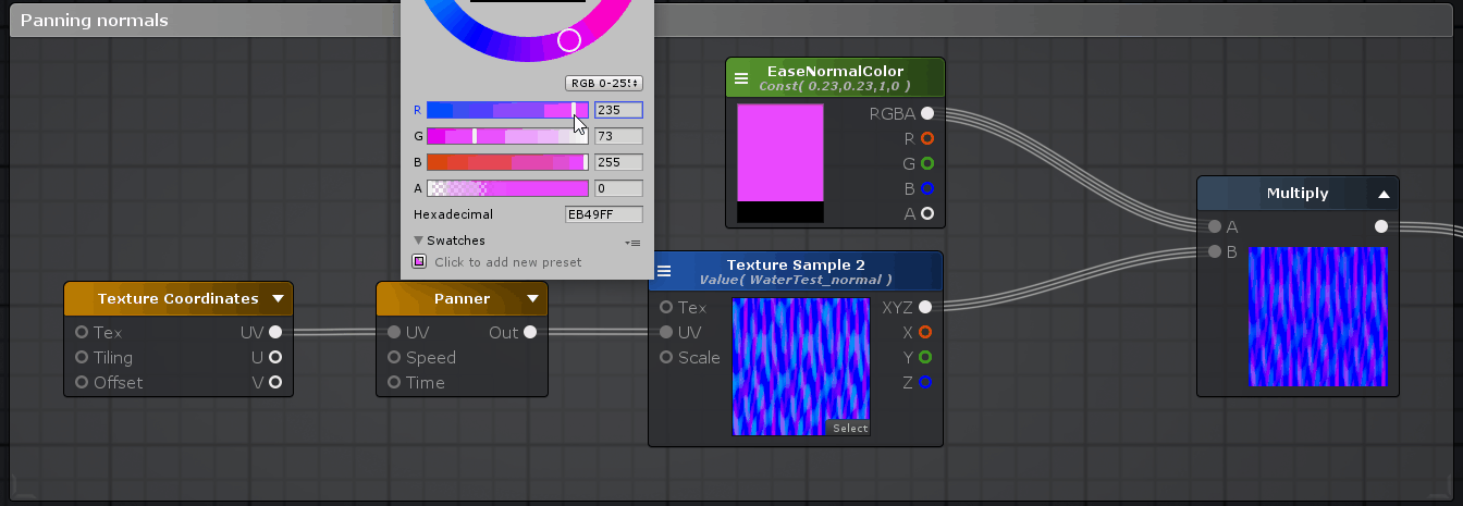
Once again we are using a single texture with some variation in panner speed/direction as well as UV tiling (flipping one of them by giving a negative U value), adding them on top of each-other to get a more random feel. We will use the output of this add to drive a bunch of other stuff; opacity (with a hard cutoff), vertex displacement as well as some color variation.
I also used a scrolling normal map. I used just one here as it moves so quickly using 2 panners for variation wouldn’t really make much of a difference in this case. I did multiply it with a blue value of 1 (it says 255, but this is the same as each color channel has 256 steps, 0 to 255), and a red and green value of 60 (or a value of 0.23 if you use the 0 to 1 scale). I did this because the normal map was way too intense and this kind of flattens it down and makes it a lot more calm. Keep the R and G value the same and increase them to bring back more intense normals. This is a nice trick to make the normals more calm and gives you a bit more customizability within the shader itself.
Alright, we got the basic stuff set up. Two grayscale panners that feel more random that we can use to drive a bunch of stuff, and a simple panner with a normal map to give some more surface detail. We also have a decent mesh to apply the material/shader to, giving us what we need to create the effect we are looking for!
Waterfall: color, opacity and vertex displacement
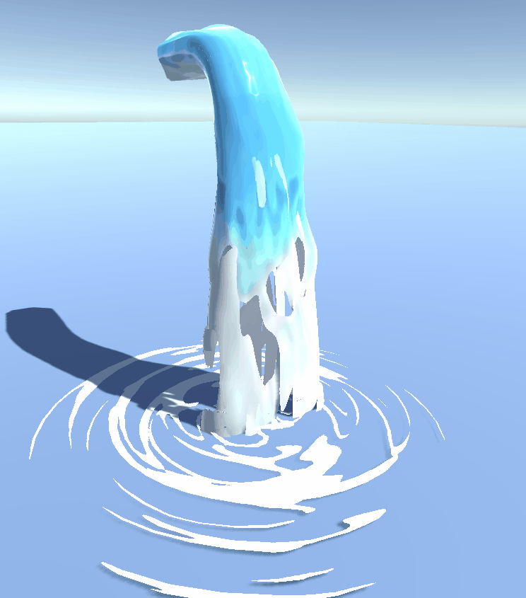
Previously we set up our mesh, the UV’s, and some basic stuff we will need in the shader to make our waterfall work. First let’s analyze a few things we see in the waterfall GIF above. You see ‘water’ scrolling down the 3D mesh, breaking up when it falls down. You can see we also use the transparent cutout render type – the waterfall either is fully opaque or fully transparent. The waterfall also changes color once it is nearing the ground. You might also notice the water looks a lot less smooth on the white (foam) areas than it does on the blue areas. Next to this, you can also see some vertex displacement we talked about earlier. This gives the waterfall a far less static and much more lively feel to it. We will discuss each of these things, starting with the most simple one: the color. I recommend that you just read along for now, and if you want to recreate it wait until you have read everything.
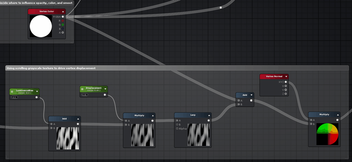
As you can see, I’m just lerping (linear interpolation) 2 colors. Roughly said, I’m using the scrolling grayscale texture we made previously here as the alpha for the lerp. This means that the scrolling grayscale texture we supply as input basically acts as a mask to decide whether to show the blue color, or the white ‘foam’ color. The add here is hooked up to a vertex color node.
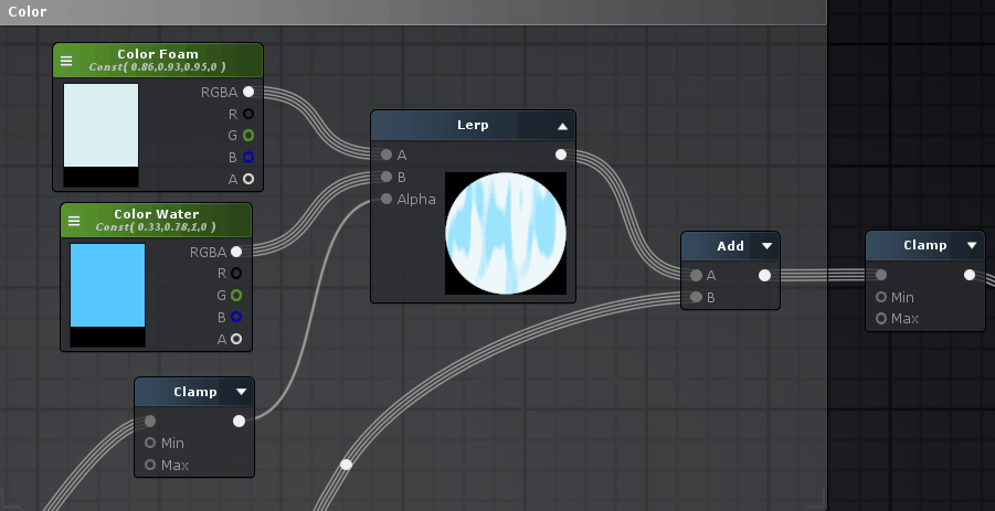
Below you can see the vertex colors I’m using. Similar to how we utilized vertex colors for the wrinkles, it acts as a gradient. This time however we are using it to drive some other things as well. For the color we use it to make sure the water turns more and more white towards the bottom of the waterfall, by adding it on top of the color output of the lerp. The reason we use a clamp at the end, is to make sure the maximum values do not exceed 1 (the clamp has a min of 0, and max of 1). Because we add the vertex colors on top of the color we already have (the whitest point of the vertex color = 1), you see how this could easily exceed 1. When we plug values more then 1 in our color input of the main node we would get unwanted results (too bright). The way we are using the white and blue colors also makes sure that once the water ‘breaks’ it is in a white (foam) area of the mesh and will always have a white border around the transparent areas. Apart from this, the lighter the vertex color, the more the vertices are pushed outward. This way the bottom of the waterfall, which is lighter in vertex color move a lot more wildly. As you can see the bend of the waterfall is also a bit lighter so it moves more around this area.
Apart from this, I also have 2 extra meshes inside the main waterfall. This is so that the waterfall feels like it has more volume. The other two meshes are modified versions of the main mesh, with the same UV’s but only moved around a little in UV space / flipped so that the material looks different on all 3 meshes. If you want you could create LODs for the mesh so that when it’s further away, the ‘inner parts’ of the mesh are removed to reduce complexity and improve performance.
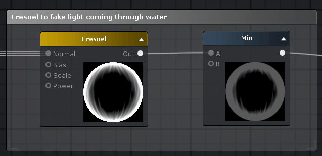
Additionally, I also used a fresnel in the emission to fake the light coming through the water. A fresnel makes a pixel more white the more the surface of a 3D object ‘looks away from you’ (based on the vertex normals) and more black the more it looks ‘at you’. Because the waterfall is ‘thinner’ when you look at it from an angle, I used a fresnel to fake more light coming through the waterfall in those areas. I just used the normal from earlier as well (it uses the supplied normal and the vertex normals of the mesh to calculate the ‘direction’ the surface of the 3D model is facing). I used a min node to tone the fresnel down a lot. Obviously we don’t want the waterfall to look like it actually emits light itself so the effect has to be a bit subtle. Fresnels are often used with water shaders to change the color based on the angle you are looking at it. Plugging in 0 (black) into the emission wouldn’t do anything, and plugging in 1 (white) would sort of make it an ‘unlit’ shader, making it ignore the lighting situation and look fully lit from all direction even if it would stand in a shadow. If you want you could multiply the result of the min-node with a color so you can control the color of the fresnel and plug, for example, a yellow fresnel into the emission.
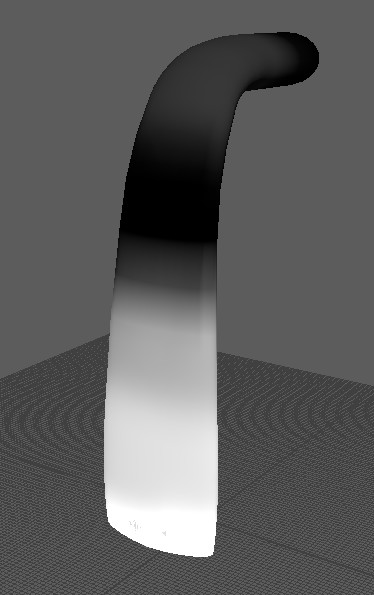
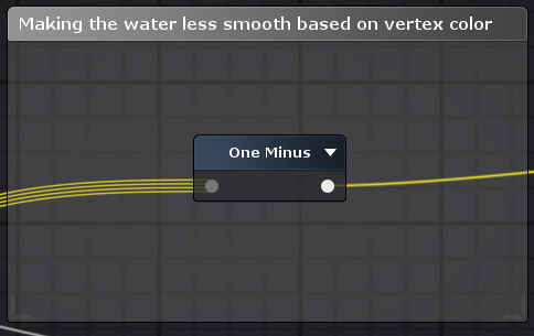
For the smoothness, I took the vertex colors and ‘flipped’ them using a one minus node. If you scroll up a little bit, you see the vertex colors are light at the bottom and dark at the top. By flipping this (so light at the top and dark at the bottom) we can use this to make the lower part of the waterfall less smooth (or shiny), compared to the top. For smoothness, darker values equal a less smooth surface and lighter values make the surface more and more smooth.
Vertex displacement, or vertex offset, is an important aspect we need in order to sell this effect. By moving the vertices around the waterfall feels a lot less static, and a lot more alive. To illustrate, here’s the same waterfall with and without displacement.
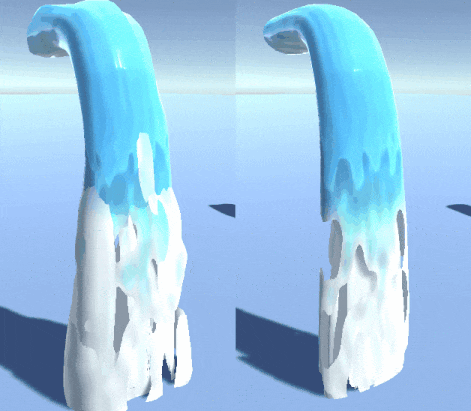
By moving the vertices based on our scrolling grayscale texture we discussed earlier, the waterfall feels a lot more like it is actually flowing. If you route a value of 0.5 into the vertex offset output of your main node, nothing would happen. Try to see a gray value of 0.5 as the ‘standard’ value of a vertex. Everything below 0.5 will move it in the negative direction, and everything above 0.5 in the positive direction.
So how do we know what ‘direction’ the vertices will really move? What is up and down?
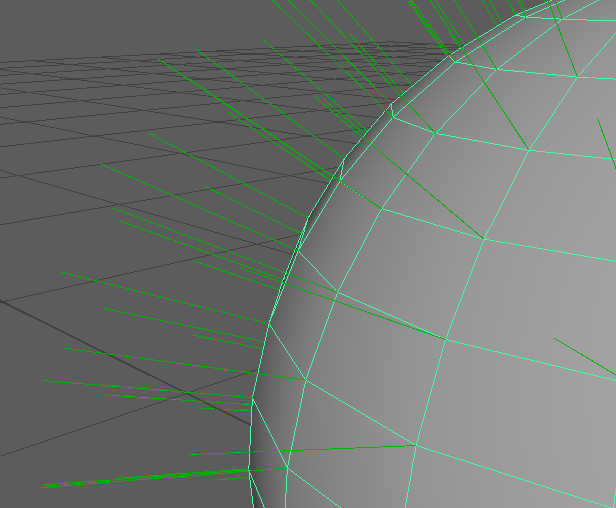
In our case, we want to move the vertices away from the surface of the mesh. A negative direction would mean a vertex would move ‘backwards’ compared to where the surface is pointing at, and a positive direction would move it ‘outward’. If we want the vertices to move like this, we can utilize the vertex normals. Every vertex, even though they are just a single ‘point’ in 3D space, all have a direction assigned to them. This direction is what we call the vertex normal, and it is used to calculate how the surface of the mesh should be shaded. In this example image I made a sphere, and set Maya to show the vertex normals (display>polygons>vertex normals). As you can see each vertex has a direction that is pointing away from the surface by default. If you wanted you can edit each vertex normal and change it’s direction but for now this is what we want. We can now use this direction in the shader and use it to tell the shader in what direction to displace the vertices.
The ‘vertex normal’ node outputs RGB values, that are based on the normal direction of the vertices of the mesh. In shaders and with normals in general RGB values are being used to express ‘3D’ XYZ direction using 2D space. We can use the RGB output that describes the surface direction to move the vertices around in that direction, by multiplying our grayscale panner we made earlier, on top of it. I added the vertex color the vertices displace ‘outward’ more at the bottom of the mesh. I added a few nodes to control the displacement amount (it’s ok if your values go below 0 or above 1 in this case).
To illustrate, here’s a sphere with a vertex normal node applied directly to the albedo (color) output of the main node.
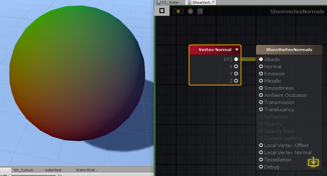
The RGB (XYZ) output of the vertex normal node is based on the vertex normals of the mesh, giving us this result.
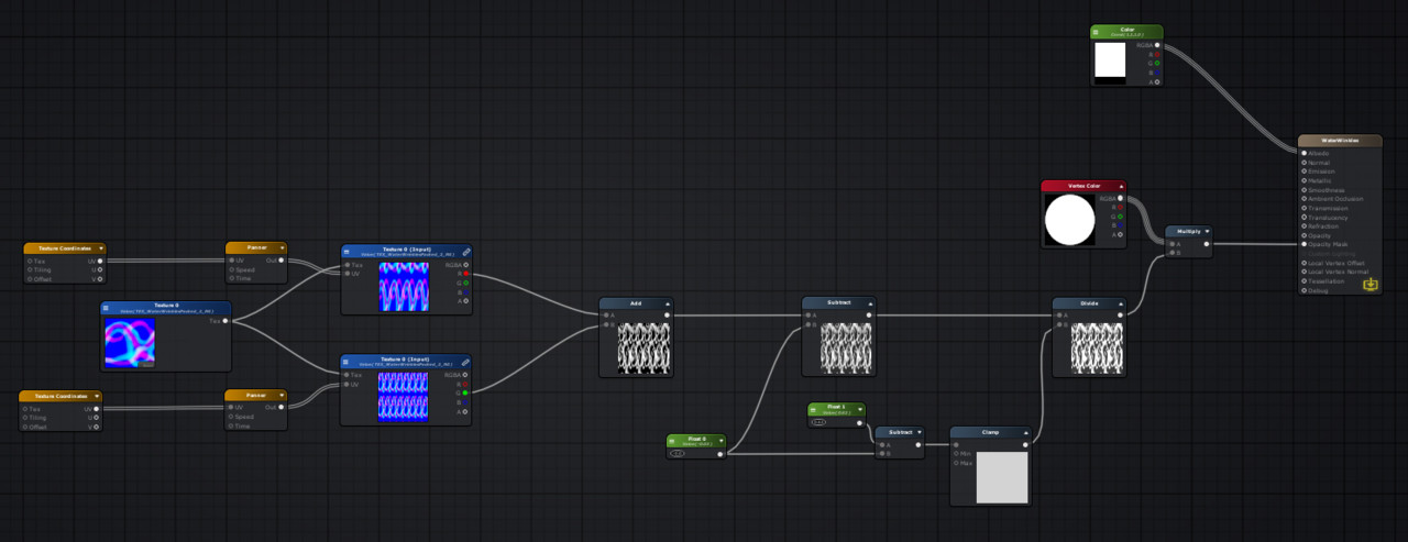
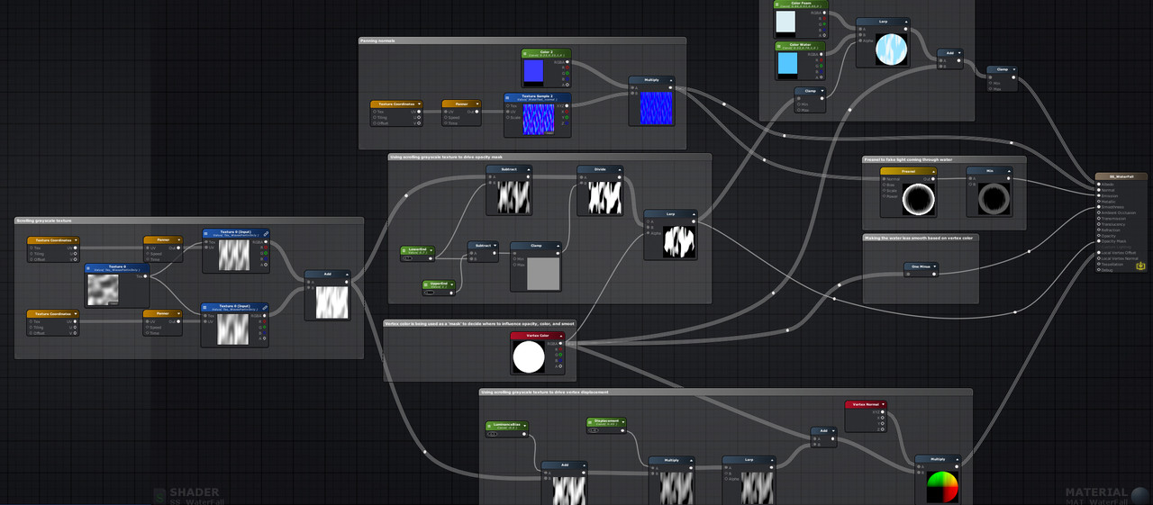
Here’s the full node structure, so you can see how everything connects.
I hope I taught you something! If you are new to shaders it might be a lot in one go. The goal was to give you enough knowledge and starting points to make this or similar effects on your own. To make stuff like this you don’t have to know and understand everything, you just have to know and understand enough to give yourself a good starting point so you know what to look for when trying to go for a certain effect. It’s not like anyone who hasn’t done anything with shaders before just opens Amplify and builds this effect in one go – before I had this waterfall I had several others that just didn’t work out. It’s a lot of back and forth, tweaking of values, and googling how others did it. Even though my starting point was Simon’s talk – I still had to do quite a lot of research, but in the process gained a deeper understanding of what I was doing, which is the most important thing. I hoped to pass on some of this knowledge by writing this blog.
If you found all of this interesting, here are some links that inspired me and might be of interest to you.
If you got any questions, suggestions or other things you want to say, feel free! You can contact or follow me on ArtStation or on Instagram.
Thanks for reading!
[ad_2]
Emprendedor en el sector de los videojuegos, tecnologica y educación. + de 20 años en videojuegos. CEO de Hydra Interactive. Fundador de Devsfromspains.

![Buildbox Free - How To Make 2D Platformer Game [PART 1]](https://e928cfdc7rs.exactdn.com/info/uploads/sites/3/2020/01/Buildbox-Free-How-To-Make-2D-Platformer-Game-PART-150x150.jpg?strip=all)

